5. Coming and Going
Selling the Ship Canal to the World
In the early 20th Century, competition for global trade is hotting up, and Salford Docks needs to sell itself to national and international audiences. Welcome to the age of advertising…

Image: The Manchester Ship Canal game (credit: Manchester Libraries, Information and Archives).
With high competition in global trade, Salford knew it had to sell the idea of its trade route, particularly to America.
The Manchester Ship Canal Company tasked designers and illustrators with selling the Ship Canal to the world. Many of these artists were from Manchester School of Art and went on to be major national figures in the art and design scene.
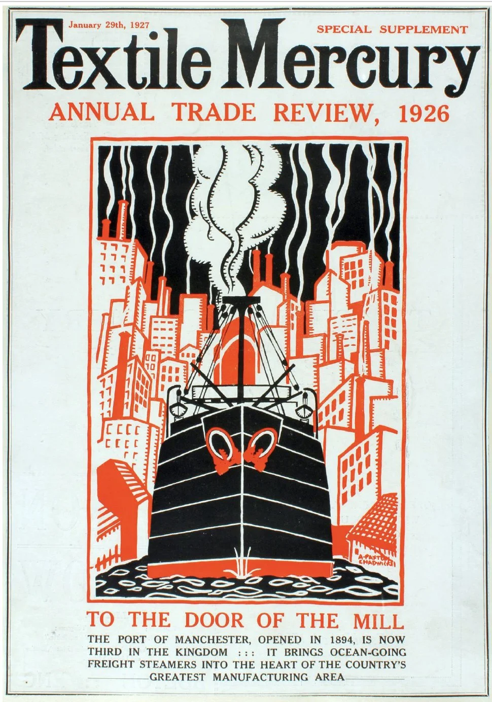
Illustration: 'To the Door of the Mill' by Albert Paxton Chadwick - a poster designer from Fallowfield who studied at Manchester School of Art. A leading modernist creative who produced this artwork for the Textile Mercury cover and Civic Week Official Guide in 1926.
The years 1919 to 1939 saw an explosion of print and marketing techniques.
Adverts highlighted how well connected the Port of Manchester was, emphasising how simple and cost effective it was to do business via the Ship Canal.
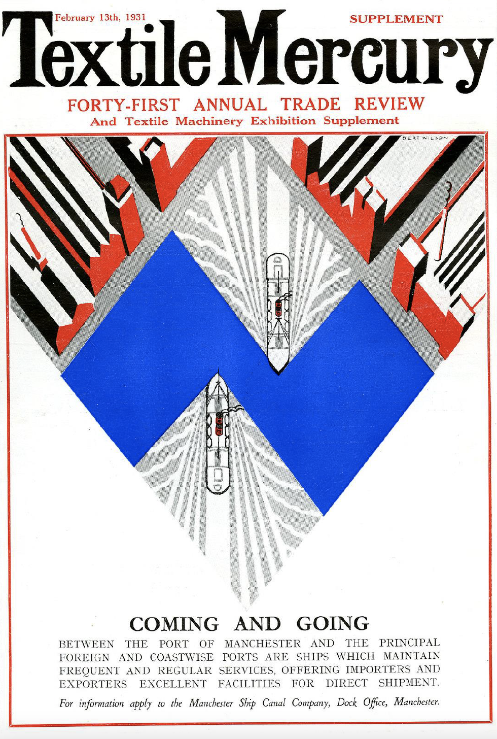
Illustration: Charles Bertie Wilson, born in Aberdeen and a student of Manchester School of Art, produced this front cover for the Manchester Guardian newspaper supplement, ‘City and Port of Manchester’, in 1927.
Pictorial map by Richard Lloyd-Jones - ‘The Economic Freight Route’ features in Manchester and the Sea (1926) for the Manchester Ship Canal Company.
In 1920, a very confident Chairman of the Manchester Ship Canal wrote to American Importers and Exporters to declare:
“Even the gloomiest pessimist admits the certainty of a trade boom for the next five years – ordinarily cheerful people like ourselves put it at far longer than that.”
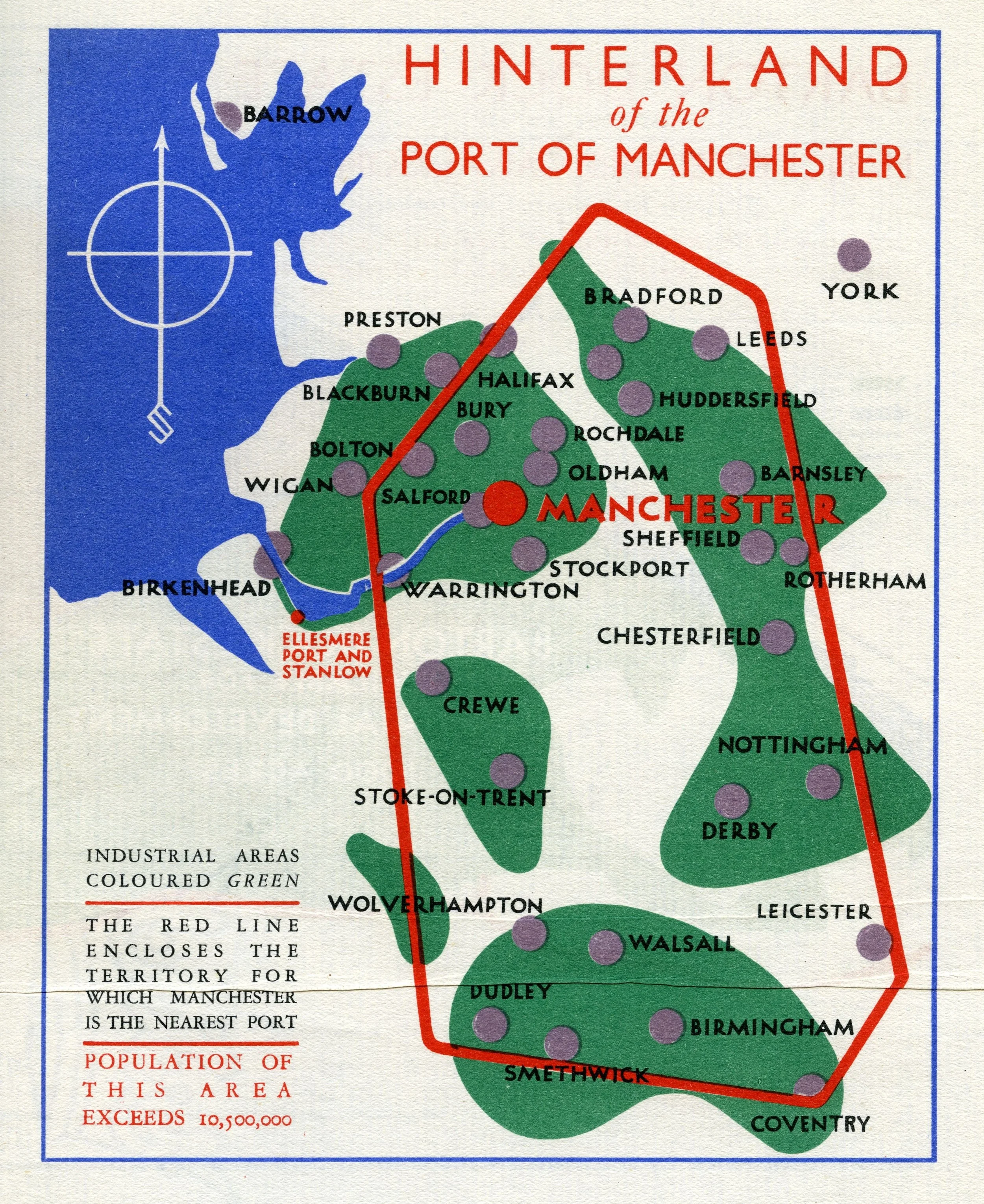
This 'Hinterland of the Port of Manchester' map was designed to sell the opportunity of the Manchester Ship Canal to UK Industry. Showcasing the extent of inland industrial areas that would benefit from the Port of Manchester as the nearest trade port.
Cloister Press
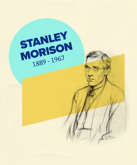
Founded in 1920, the Cloister Press created many posters, books, brochures and leaflets for the Manchester Ship Canal. Typographer, Stanley Morison, played a key role, and his work inspired the typeface ‘Stanley’, which is the font used on the identity for this Salford by the Sea trail.
In later life he went on to design the Times New Roman font, widely regarded as one of the finest achievements in print design.
Image: A pencil portrait of Stanley Morison by Sir William Rothenstein in 1923.
There was even a board game, celebrating the achievement of bringing transatlantic trade from the sea to Salford.
Cover artwork for the Manchester Ship Canal game (credit: Manchester Libraries, Information and Archives).
